Simplicity of design is a key to success. This short video illustrates why most people prefer Apple over Microsoft due to its simple, sleek, and user friendly design.
LINK
This was a reference to our Thursday class when Greg mentioned the fraying of cords. The image from an Imgur user shows the comparison between cords. For a quality driven company like Apple, even they overlook their smaller details. Here Apple decided on having a slicker form than to have a more durable one. Planned obsolescence or poor planning?
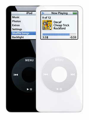
I got an email a couple months back from Apple saying that if you still own the Ipod Nano first generation (which I did own one), they advised to return it and have it replaced. They call it the Ipod Nano (first generation) Replacement Program and I thought this was a great example of TRANSPARENCY. I've had my Nano since it first came out back in 2006 and apparently over time, the battery can overheat and catch fire. As a means to prevent from this actually happening Apple is replacing the old, hazardous Nano with the swanky brand new Nano models. I've had mine sent in, but have yet to confirm what I'll get in return.
skip to 1:35 to view the finished animation if you're impatient.. you won't want to miss this!
"This film explores playful uses for the increasingly ubiquitous 'glowing rectangles' that inhabit the world.
We use photographic and animation techniques that were developed to draw moving 3-dimensional typography and objects with an iPad. In dark environments, we play movies on the surface of the iPad that extrude 3-d light forms as they move through the exposure. Multiple exposures with slightly different movies make up the stop-frame animation.
We've collected some of the best images from the project and made a book of them you can buy http://www.bit.ly/mfmbook
Read more at the Dentsu London blog http://www.dentsulondon.com/blog/2010/09/14/light-painting/ and at the BERG blog http://www.berglondon.com/blog/2010/09/14/magic-ipad-light-painting/"