I stumbled upon this website that has some example art projects from a few years back. A bunch are Reminiscent of George Orwell's 1984 and Kafka-esque literature.

Saturday, October 31, 2009
I See You Looking at Me Through the Reflection of Your Screen
Suzanne has brought up the term 'sousveillance' (recording of an activity from the perspective of a participant in the activity, typically by way of small portable or wearable recording devices that often stream continuous live video to the Internet) in class on a few occasions. An intriguing topic as it opens multiple users perspectives, painting a broader picture of an event that transpires.
Thinking about.. 'Design Thinking'.
I've been thinking about the term 'design thinking'.
What does this actually mean? Should we be separating approaches by professions (eg: 'accounting thinking', 'DJ thinking', 'library thinking', 'doctor thinking'.
Though it's been stressed that businesses are turning towards 'design thinking' as a strategy for holistic thinking and user-based experience, I can't help but wonder if 'designers' and design education actually is that different from other types of 'thinking'. Tangents with this article I just read:
If you have conversations with other friends in other profession, do you find Design actually approaches problems that differently (I was thinking re: engineered solutions for our beloved Kiosk and Headset projects), and why? Do we think this way because of our natural tendencies and life experiences, or are we bred into it?
Barbarians to Bureaucrats - WHAT TYPE OF LEADER ARE YOU?
"The history of civilizations and corporations reveals a common pattern." - Lawrence M. Miller, author of Barbarians to Bureaucrats.
I read this book over the summer and it is an interesting look at how to categorize different types of leadership styles. Miller uses historical figures/events to illustrate that the life cycle of the leader changes with each new stage of development or decline in a corporation or a civilization.
The Prophet, Barbarian, Builder/Explorer, Administrator, Bureaucrat, Aristocrat, and the Synergist are 7 types of leaders that appear in different stages of a company/civilization's life cycle. I find these categories not unlike the ones used by Basadur. For example, Miller describes the Prophet as the innovator and the leader that inspires, bringing to mind the role of Basadur's Conceptualizer. Miller's Administrator (systems, structure and security) can be likened to Basadur's Optimizer.
I think Miller makes an interesting case for his view on the life cycle of leadership roles within a given organization. Citing historical figures/events/civilizations as examples to prove his point makes for an interesting read and is a fun and engaging way to illustrate how leadership styles must be able to change and adapt if an organization/group/society is to prevail.
Moreover, identifying what types of leaders you may be working alongside within a group setting is very useful, and understanding the characteristics/traits of different leader types is invaluable in creating an efficient and coherent team.
Friday, October 30, 2009
THE SMILE OR PAIN HAT
happiness hat from Lauren McCarthy on Vimeo.
Hi Guys! Speaking of the 6 thinking hats that we learned, this can be another hat that forces you to smile! This is a hat that will sense if you are smiling or not. If you don't smile, it will know and will create pain for you. There is a mechanism at the back that will push a sharp object into you head....
Will this hat really promote positive thinking or will it be a burden? ahahhahaha
What a hat...
trends

While doing research for Assignment B, I came across a very interesting report that sheds some light on our cultural climate. It's the David Report published by Swedish designer/strategist David Carlson. The report is called 5 Key Trends. You can download the PDF from this link!
Thursday, October 29, 2009
THE EYEBALLING GAME
Leave all rulers, protractors and compasses in your backpack.
See how accurate your 'eyeballing' is:
THE EYEBALLING GAME
Who knows, this might improve your confidence in drawing classes (drawing in perspective without creating a bounding box and/or vanishing lines).
Post your scores in the following comments section.
Cheers,
Kurt.
See how accurate your 'eyeballing' is:
THE EYEBALLING GAME
Who knows, this might improve your confidence in drawing classes (drawing in perspective without creating a bounding box and/or vanishing lines).
Post your scores in the following comments section.
Cheers,
Kurt.
Don't Procrastrinate

We are all guilty. We really are.
We perpetually have piles and piles of work to do and yet we procrastinate. Why?
According to indiahowto.com and businesstown.com, here are 5 reasons why we procrastinate:
1) When something is difficult, we choose to do something which is easier.
2) When something is time consuming, we choose to do something which provides immediate or near immediate gratification.
3) When we feel that we lack the knowledge or skills to complete the task as we want to.
4) We are afraid.
5) We are not really committed to the task at hand. WE MUST REMAIN PASSIONATE
Why are you putting off what you need to do? Ask yourself.
43 Folders a site which Suzanne mentioned in class, has a great video by Merlin Mann, on the top of the page right now which is called We Procrastinate When We've Forgotten Who We Are. Watch.
H
IDEO Method Cards

These are a fun little tool to have around the office or home. Similar to playing cards (except they only have 51 cards), they also have four categories: Ask, Watch, Learn, Try. These define the activities to generate ideas and discussions and include a real life example from IDEO's practice.
Description from the IDEO website:
"IDEO Method Cards is a collection of 51 cards representing diverse ways that design teams can understand the people they are designing for. They are used to make a number of different methods accessible to all members of a design team, to explain how and when the methods are best used, and to demonstrate how they have been applied to real design projects."
For MAC users, IDEO have now made a number of these cards available as a widget that you can use as part of your dashboard. A really neat thing is the ability to create your own cards from your own experiences! You can download it here.
Its just product design!
hey guys,
We are heading into thesis next year and even closer thesis prep. Take a look at this post about this book, Deconstructing product design a followup of sorts to Universal Product Design.
http://www.designingforhumans.com/idsa/2009/10/book-review-deconstructing-product-design.html
Jason
We are heading into thesis next year and even closer thesis prep. Take a look at this post about this book, Deconstructing product design a followup of sorts to Universal Product Design.
http://www.designingforhumans.com/idsa/2009/10/book-review-deconstructing-product-design.html
Jason
urban fashion trends
Its difficult to gauge fashion trends or maybe all trends. By the time it goes online is the trend over? going on now? No one knows for certain. Anyway for the latest in urban fashion...take a look
http://hypebeast.com/
http://hypebeast.com/
Vases
Well, I know everyone's busy and hectic,but i found a couple of interesting vases that could probably give you guys some inspirations on the compound curves project.Here were a couple of vases that i found interesting and unique.Good Luck~
Tilting vase By David Sweeny
Poloroid Flower vase


Acrylic Humidifier Vase


Dancing Vase


Barbara Carafe Vase


Wednesday, October 28, 2009
Office Trends
The temporary and mobile workplace combined with exercise. For the modern office?
 The Walkstation is the fully integrated combination of an electric height-adjustable worksurface with an exclusively engineered, low speed commercial grade treadmill.
 Similiar solution from TreadDesk.
 Workplace Scooters from OhGizmo
 Innovation C by Blå Station
 Flamingo by Nola
The Walkstation is the fully integrated combination of an electric height-adjustable worksurface with an exclusively engineered, low speed commercial grade treadmill. Similiar solution from TreadDesk.Workplace Scooters from OhGizmoInnovation C by Blå StationFlamingo by Nola
Calling all pool sharks!
The flames and the bikini babe... mehh, not that great. But the waves and ripples... WOW!
Digital Pool Table
Cheers,
Kurt.
Digital Pool Table
Cheers,
Kurt.

http://www.treehugger.com/files/2009/10/would-you-drink-bottled-water-if-it-came-in-a-recyclable-paper-container.php
Would You Drink Bottled Water If It Came in a Recyclable Paper Container?
Tuesday, October 27, 2009
Core Research
Heres an interesting article that quickly touches upon the visually impaired. This article "The Blind really do hear Better" gives finding on research on the age old question: do those who cannot see have there other senses hightened? (eg. hearing) This info can prove useful when thinking of headset devices for our core class.
Also the basics of visual impairment (eg. degrees of blindess, defining legally blind, etc.) and statistics can be found at the braille institute.
Also the basics of visual impairment (eg. degrees of blindess, defining legally blind, etc.) and statistics can be found at the braille institute.
Monday, October 26, 2009
already posted. Yes? No?
This is something that if you've talked to me i probably already showed you. It's something I show to people complaining about Rhino, or having to learn 3d modelling. In my opinion, this is where that is headed. It's basically a cross between modelling and sketching... but way more intuitive.
I love sketch
I love sketch from the school up the street.
I love sketch
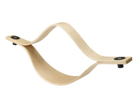
Curves!!


The Fiore Sofa was designed by Shirley (Xue Qin) Sun Benoit, manufactured by Impulses International Furniture from Bern, Switzerland, and has received a Red Dot Award for product design in 2009. The sofa has a design inspired from the image of a flower and is handmade of synthetic rattan and aluminum frame.
These are beautiful examples of curves, there is a sense of motion and tactile qualities. You can arrange it in many forms to create patterns and it also interlocks. See the resemblances to our class projects?
Create fun
Thought you all needed to see this. Very important.
http://www.telegraph.co.uk/culture/culturepicturegalleries/6407277/Bent-Objects-by-Terry-Border-The-Secret-Life-of-Everyday-Things.html
http://www.telegraph.co.uk/culture/culturepicturegalleries/6407277/Bent-Objects-by-Terry-Border-The-Secret-Life-of-Everyday-Things.html
DZL
more brain building
hey guys,
in looking for a good interactive brain building exercise for next class, found this one page that has links to other brain building/teasing quizes, puzzles and other things that keep your brain young.
http://www.missiontolearn.com/2009/07/brain-training-exercises/
jason luk
in looking for a good interactive brain building exercise for next class, found this one page that has links to other brain building/teasing quizes, puzzles and other things that keep your brain young.
http://www.missiontolearn.com/2009/07/brain-training-exercises/
jason luk
Sunday, October 25, 2009
When to Use Which User Experience Research Methods
Summary: Modern day user experience research methods can now answer a wide range of questions. Knowing when to use each method can be understood by mapping them in 3 key dimensions and across typical product development phases.
The field of user experience, is blessed (or cursed) with a very wide range of research methods, ranging from tried-and-true methods such as lab-based usability studies to those that have been more recently developed, such as desirability studies (to measure aesthetic appeal).
You can't use the full set of methods on every project, but most design teams benefit from combining insights from multiple research methods. The key question is what to do when. To better understand when to use which method, it is helpful to realize that they differ along 3 dimensions:

Art or Science?
In the end, the success of your work will be determined by how much of an impact it has on improving the user experience of the website or product in question. These classifications are meant to help you make the best choice at the right time.
Learn moreLearn more about user research methods such as Usability Testing and Field Studies at the Usability Week 2009 conference in Washington DC, San Francisco, London, and Sydney.
The field of user experience, is blessed (or cursed) with a very wide range of research methods, ranging from tried-and-true methods such as lab-based usability studies to those that have been more recently developed, such as desirability studies (to measure aesthetic appeal).
You can't use the full set of methods on every project, but most design teams benefit from combining insights from multiple research methods. The key question is what to do when. To better understand when to use which method, it is helpful to realize that they differ along 3 dimensions:
- Attitudinal vs. Behavioral
- Qualitative vs. Quantitative
- Context of Website or Product Use
The following chart illustrates where several popular methods appear along these dimensions:

Each dimension provides a way to distinguish between studies in terms of the questions they answer and the kinds of purposes they are most suited for.
The Attitudinal vs. Behavioral Dimension
This distinction can be summed up by contrasting "what people say" with "what people do" (very often quite different). The purpose of attitudinal research is usually to understand, measure, or inform change of people's stated beliefs, which is why attitudinal research is used heavily in marketing departments.
While most usability studies should rely more on behavior, methods that use self-reported information can still be quite useful. For example, card sorting provides you with insights about users' mental model of an information space, which can help you determine the best information architecture for your site. Surveys measure attitudes or collect self-reported data that can help track or discover important issues with your site. Focus groups tend to be less useful for usability purposes, for a variety of reasons.
On the other end of this dimension, methods that focus mostly on behavior usually seek to understand "what people do" with minimal interference from the method itself. A/B testing only changes the site's design, but attempts to hold all else constant, in order to see the effect of site design on behavior, while eyetracking seeks to understand how users visually interact with interface designs.
Between these two extremes lie the two most popular methods we use: usability studies and field studies. They utilize a mixture of self-reported and behavioral data, and can move toward either end of this dimension, though leaning toward the behavioral side is generally recommended.
The Qualitative vs. Quantitative Dimension
The basic distinction here is that, in qualitative studies, the data is usually being gathered directly, whereas in quantitative studies, the data is gathered indirectly, through an instrument, such as a survey or a web server log. In field studies and usability studies, for example, the researcher directly observes how people use technology (or not) to meet their needs. This gives them the ability to ask questions, probe on behavior or possibly even adjust the study protocol to better meet its objectives. Analysis of the data is usually not mathematical.
By contrast, insights in quantitative methods are typically derived from mathematical analysis, since the instrument of data collection (e.g., survey tool or web-server log) captures such large amounts of data that are coded numerically.
Due to the nature of their differences, qualitative methods are much better suited for answering question about why or how to fix a problem, whereas quantitative methods do a much better job answering how many and how much type of questions. The following chart illustrates how the first two dimensions affect the types of questions that can be asked: 
The Context of Product Use DimensionThe final distinction has to do with how and whether participants in the study are using the website or product in question. This can be described by:
- Natural or near-natural use of the product
- Scripted use of the product
- Not using the product during the study
- A hybrid of the above
When studying natural use of the product, the goal is to minimize interference from the study in order to understand behavior or attitudes as close to reality as possible. Many ethnographic field studies attempt to do this, though there are always some observation biases. Intercept surveys and data mining/analytic techniques are quantitative examples of this.
A scripted study of product usage is done in order to focus the insights in very specific ways, such as on a redesigned flow. The degree of scripting can vary quite a bit, depending on the study goals. For example, a benchmarking study is usually very tightly scripted so that it can produce reliable usability metrics.
Studies where the product is not used are conducted to examine issues that are broader than usage and usability, such as a study of the brand or larger cultural behaviors.
Hybrid methods use a creative form of product usage to meet their goals. For example, participatory design allows users to interact with and rearrange design elements and discuss why they made certain choices.
Most of the methods in the chart can move along one or more dimensions, and some do so even in the same study, usually to satisfy multiple goals. For example, field studies can focus on what people say (ethnographic interviews) or what they do (extended observation); desirability studies and cardsorting have both qualitative and quantitative versions; and eyetracking can be scripted or unscripted.
Phases of Product Development
(the time dimension)Another important distinction to consider when making a choice among research methodologies is the phase of product development and its associated objectives.
- STRATEGIZE: In the beginning phase of the product development, you are typically considering new ideas and opportunities for the future. Research methods in this phase can vary greatly.
- OPTIMIZE: Eventually, you will reach a "go/no-go" decision point, when you transition into a period when you are continually improving the design direction you have chosen. Research in this phase is mainly formative and helps you reduce the risk of execution.
- ASSESS: At some point, the website or product will be available for use by enough users where you can begin measuring how well you are doing.
The table below summarizes these goals and lists typical research approaches and methods associated with each:

Art or Science?
While many user experience research methods have their roots in scientific practice, their aims are not purely scientific and still need to be adjusted to meet stakeholder needs. This is why the characterizations of the methods here are meant as general guidelines, rather than rigid classifications.
In the end, the success of your work will be determined by how much of an impact it has on improving the user experience of the website or product in question. These classifications are meant to help you make the best choice at the right time.
Learn moreLearn more about user research methods such as Usability Testing and Field Studies at the Usability Week 2009 conference in Washington DC, San Francisco, London, and Sydney.
design & access statements
 What is a design statement?
A Design and Access Statement is a document used to explain and illustrate the principles and concept behind the design and layout of your proposed development and should be submitted with your planning application. Relevant to both large and small-scale developments they are particularly important in demonstrating how a proposal relates both to the site and its wider context, the surrounding area and examine how access has been dealt with.
The statement must also demonstrate how inclusive access requirements have been met. That is, how everyone can get to and move through the place on equal terms regardless of age, disability, ethnicity or social grouping.
The existence of a Design and Access Statement does not guarantee planning permission. It supports a planning application - it does not replace it.
____________________________________________-
how the statement would help?
A Design and Access Statement will help the local planning authority, prospective funder/s (i.e. One NorthEast - more information), neighbours, the general public and you to:
- Consider your proposals against urban design principles and policies in the Local Plan/Unitary
- Development Plan/Local Development Framework and other relevant documents i.e. site
- development/design briefs.
- Fully understand the design principles of your proposals.
- Realise how your development will fit into and/or enhance the area.
- Discuss the design of your proposals in a structured, more productive way.
- Decide whether your proposal is likely to be acceptable.
- Consider the access needs of a range of users.
A Design and Access Statement helps ensure that the main issues influencing your design are explained in a clearer, structured and visual way. This makes it easier for people who need to be consulted to understand the thinking behind your chosen design. It helps in assessing your proposals more quickly and reduces the need for often costly and time consuming redesigns.
A statement sets out the principles on which a development is based and explains the design solution
____________________________________________________________
Sounds like a lot of work
The steps in preparing a Design and Access Statement correspond to those involved in going through the proper design process. It is work you would normally carry out in the process of deciding on a design for your proposals before submitting a planning application. The only difference is that you are expected to formally record these steps and explain the results so it is clear to others. A Design and Access Statement is not simply a justification for a pre-determined design solution.
There are several essential steps in the design process which should be mirrored in the production of a Design and Access Statement: These are the description of the design context, identifiable of design principles and the check in of design solution. The graphic illustrates these steps and the actions required to undertake them.

Once all the steps have been completed, the design and access statement can be assembled, bringing together all the thinking on the design issues.
__________________________________________________________________
for more information:
Concept Fan:Widening the Search for Solutions
The Concept Fan is a way of finding different approaches to a problem when you have rejected all obvious solutions. It develops the principle of 'taking one step back' to get a broader perspective.
How to Use the Tool:
To start a Concept Fan, draw a circle in the middle of a large piece of paper. Write the problem you are trying to solve into it. To the right of it radiate lines representing possible solutions to the problem. This is shown in Figure 1:

It may be that the ideas you have are impractical or do not really solve the problem. If this is the case, take a 'step back' for a broader view of the problem.

The idea of the Concept Fan was devised by Edward de Bono in his book 'Serious Creativity' - this is one of the books reviewed on right-hand side of this page. The book shows how to use many similar tools.
Key points:The Concept Fan is a useful technique for widening the search for solutions when you have rejected all obvious approaches. It gives you a clear framework within which you can take 'one step back' to get a broader view of a problem.
To start a concept fan, write the problem in the middle of a piece of paper. Write possible solutions to this problem on lines radiating from this circle.
If no idea is good enough, redefine the problem more broadly. Write this broader definition in a circle to the left of the first one. Draw an arrow from the initial problem definition to the new one to show the linkage between the problems. Then radiate possible solutions from this broader definition.
Keep on expanding and redefining the problem until you have a useful solution.
REF - http://www.mindtools.com/pages/article/newCT_06.htm
How to Use the Tool:
To start a Concept Fan, draw a circle in the middle of a large piece of paper. Write the problem you are trying to solve into it. To the right of it radiate lines representing possible solutions to the problem. This is shown in Figure 1:

It may be that the ideas you have are impractical or do not really solve the problem. If this is the case, take a 'step back' for a broader view of the problem.
Do this by drawing a circle to the left of the first circle, and write the broader definition into this new circle. Link it with an arrow to show that it comes from the first circle:

Use this as a starting point to radiate out other ideas
If this does not give you enough new ideas, you can take yet another step back (and another, and another…):

Use this as a starting point to radiate out other ideas
If this does not give you enough new ideas, you can take yet another step back (and another, and another…):

The idea of the Concept Fan was devised by Edward de Bono in his book 'Serious Creativity' - this is one of the books reviewed on right-hand side of this page. The book shows how to use many similar tools.
Key points:The Concept Fan is a useful technique for widening the search for solutions when you have rejected all obvious approaches. It gives you a clear framework within which you can take 'one step back' to get a broader view of a problem.
To start a concept fan, write the problem in the middle of a piece of paper. Write possible solutions to this problem on lines radiating from this circle.
If no idea is good enough, redefine the problem more broadly. Write this broader definition in a circle to the left of the first one. Draw an arrow from the initial problem definition to the new one to show the linkage between the problems. Then radiate possible solutions from this broader definition.
Keep on expanding and redefining the problem until you have a useful solution.
REF - http://www.mindtools.com/pages/article/newCT_06.htm
Wear Whaaat?

Great collection of inspiring wearable technology projects in this online book:
Fashionable Technology.
http://site.ebrary.com/lib/oculocad/docDetail.action?docID=10310131&p00=fashionable%20technology
This link only seems to work on campus. I'm at home and its reading : "Unauthorized Access"
Value through Change of Perspective
This is an excellent TED talk by the advertiser Rory Sutherland. He talks about how changing perspective on something is much easier and often better than changing the thing itself. I think every designer not just advertisers would benefit from learning to think this way, especially since this underlying sense of value seems like it can really make or break a product, as we've just explored with SpatialViews screen.
http://www.ted.com/talks/rory_sutherland_life_lessons_from_an_ad_man.html
http://www.ted.com/talks/rory_sutherland_life_lessons_from_an_ad_man.html
The Intelligent Bump!!!

Hi guys, i think this idea would be awesome to have for good drivers or positive damaging for bad driver's car as well. But on a side note,we know that you and I will hit those bumps with some speed sometimes...I say those bumps should go even higher for more damaging results....just to make people scared...hahahah!
Saturday, October 24, 2009
History of Mind Maps
I was interested in seeing how mind mapping came about.....it's pretty amazing. check out this really short history. Enjoy!
http://www.mindmeister.com/content/historyofmm
http://www.mindmeister.com/content/historyofmm
creative techniques
hey guys,
how often have we been creatively stuck? More times than you would care to admit i am sure.
Anyway here are some methdologies for idea generation, implementation, problem ID, and even idea selection. Some of them may seem confusing but if you go through it, you'll find they are are petty effective.
http://creatingminds.org/tools/tools.htm
Jason
3D Rendering is Cool!
Happy Saturday!
Here's come super cool rendering videos that go through the process of creating a way cool animation without being too long and getting boring!
H
Here's come super cool rendering videos that go through the process of creating a way cool animation without being too long and getting boring!
H
Friday, October 23, 2009
The Universal Phone Has Sighted People Jealous
a good example of "universal design" A cellphone designed for visually impaired but we can use it too, something adds to our research of the headset project. There's actually something in common we share with blind people... and I really like their slogan "We are the same people" "We can see vs. We can feel" it just make sense!
http://www.yankodesign.com/2009/08/13/the-universal-phone-has-sighted-people-jealous/
http://www.yankodesign.com/2009/08/13/the-universal-phone-has-sighted-people-jealous/
Graphic Design
After our crit this morning looking around the room I realized (moreso than I did the day before) that my posters were just ugly. For those of you in who are somewhat uncertain of your graphic skills, or you already really rock and want to keep showing up the rest of us, here's the blog for Toronto design firm amoebacorp, which is called DesignPorn (Hilary was this your inspiration?)
I really like how they've expanded on the regular layout of a blog by having humourous categories, which you'll encounter upon arrival. The content consists of art, graphic design, architecture, industrial design, and whatever in the world inspires or repulses them.
If only they'd stop and try to read it for themselves, the text is painfully light against a white background.
Thursday, October 22, 2009
Photosketch software
This software was published in Siggraph Asia 2009.
But...user can make better image to use only simple sketch.
http://www.youtube.com/watch?v=_Nu79WoiHlY
It is invented by five students.
(Tao Chen, Ming-Ming Cheng, Shi-Min Hu, Ping Tan, Ariel Shamir)
This is not a 3D program.But...user can make better image to use only simple sketch.
http://www.youtube.com/watch?v=_Nu79WoiHlY
Dyson air multiplier

Electric fan without fan.
Dyson did amazing work again!
There are more information http://www.dyson.co.uk/fans/
TED talks sound
I was perusing TED and came across this talk by Julian Treasure on four ways that sound affects us. As a designer this is something we need to keep in mind as its an important part of user/consumer experience.
idea generation tool
Link to idea generation tool. i like spiderman
http://www.youtube.com/watch?v=VAAwnL-PaEM
http://www.youtube.com/watch?v=VAAwnL-PaEM
Change Observer
http://changeobserver.designobserver.com/entry.html?entry=11347
An excellent blog by a socially conscious graphic designer
of particular interest is the charette he does on road signs, and how they cannot be read by the partially blind since they are so text heavy
the article is about half way down the page it has pictures of road work construction on sidewalks
An excellent blog by a socially conscious graphic designer
of particular interest is the charette he does on road signs, and how they cannot be read by the partially blind since they are so text heavy
the article is about half way down the page it has pictures of road work construction on sidewalks
Wednesday, October 21, 2009
Scathing Review of Wazabee 3DeeShell
Gizmodo gives a scathing review of the subject of our project. I don't know if any of you have tried this yet, but just type "Wazabee Review" into Google and see how many sites are totally hating on this shit.
Gizmodo calls it "a train wreck of molded plastic, a product so horridly useless, even amongst novelty gadgets, that it should be banned from sale in the free market."
CompSciCon says to prepare to be disappointed if you're looking for anything other than a protection case for your iPhone and calls the screen obtrusive, deems it the biggest piece of junk they've ever seen.
A complete thesis example.

I have been attending the ID grad show for over 10 years and I have to say that the last two years have been very disappointing and I feel the school is reaching in too many broad directions and the graduate work has left me perplexed and confused. I have often visited the shows with friends and family and unfortunately they had left the grad hows commenting on how poorly the ID work looked and how confusing many of the exhibits were.
The purpose of this blog is to share my thoughts on what makes a good thesis presentation:
1. Clarity of concept. No one should be left scratching their heads about what you are trying to do.
2. Lots of examples of ideation and research. This is some of the most interesting stuff.
3. Simple and easy to follow presentation. Not too wordy. Use good graphic design, video, colour, etc. Make sure that your project is near eye level. This may require you build a stand.
4. Low and high fidelity models as needed to clarify the concept. Nothing beats being able to walk up and experience your concept.
5. Be ready to show yourself off to the world. You are creative so don't keep it to yourself!
Here is what I think is a complete thesis and a level of quality we can all achieve for 4th year.
It does take thoughful planning and management to achieve all the aspects (research, ideation, model making, video editing, storyboarding, etc).
I am very impressed by the video of the thin plug for the UK power system. Check it out and I hope everyone gets some great ideas for their final projects.
Is there such a thing as truly sustainable design?
hey all : )
My turn to post on the blog.
I'm taking Sustainability and Design this semester and I came across this fantastic talk on Ted.com by William McDonough co-author of Cradle to Cradle. Its an amazing book that examines the paradigm of Sustainability in the fields of environmental and industrial design.
Definitely check it out... (the book and the blog) seriously it WILL totally change the way you approach "eco-friendly" design in all future projects : )
http://www.ted.com/talks/william_mcdonough_on_cradle_to_cradle_design.html
Does Intergrative Creavity Exist Today? Where Do They Exist? D-Schools Or B-Schools? And Is There A Place For A-School In Our Future?
http://mootee.typepad.com/innovation_playground/2009/10/does-intergrative-creavity-exist-today-where-do-they-exist-dschools-or-bschools.html
It's an article by Idris Montee, a business stratgist and innovation specialist.
We were doing "Competitive Landscape" in this class, so I was searching competitive landscape on google..and realize there's actually a difference between "C. L." done by business people and that are done by designers. A lot of articles in Idris' blog, talk about how design or designer position themselves in differnet business models, which I think it's pretty relevent to what we are doing now in this class...
Desktop Organization, yo!
Hey again,
Last year at Changing The World, I had a chance to meet up with Anand Agarawala, creator of an upcoming desktop organizational tool which is totally way cool :) I'm not sure if it's done beta testing yet, but still...
check it out
H!
Last year at Changing The World, I had a chance to meet up with Anand Agarawala, creator of an upcoming desktop organizational tool which is totally way cool :) I'm not sure if it's done beta testing yet, but still...
check it out
H!
3D for real!

http://www.youtube.com/watch?v=Jd3-eiid-Uw
Johnny Chung Lee used the UV camera on the front of a Wii remote to track 2 UV LEDs he installed into a pair of glasses, to create a real 3D display.
ok so the display is actually 2D but it knows where your head is and adjusts the perspective accordingly, the effect is mind blowing awesome 3D-ness
OCAD School Uniforms
Hi everyone!
I have decided to design and create a school uniform for myself for my day to day activities at OCAD.
I want to take design cues from the architecture and community of OCAD, as well as incorporating "shop" type clothing and trends (ex. scarf).
Any ideas?
H
I have decided to design and create a school uniform for myself for my day to day activities at OCAD.
I want to take design cues from the architecture and community of OCAD, as well as incorporating "shop" type clothing and trends (ex. scarf).
Any ideas?
H
Another hat to add to '6 HAT THINKING"

Ash-tray Hat
Maybe all the ideas formulated/shared by the wearer of this hat are terrible, or 'TOXIC' [as Jules put it].
(a hat from Ladies Day at the Royal Ascot races)
Cheers,
Kurt.
Electric bass? - Nope, it's a Cello.
Think this is, or is close to, the Cello Jules mistook for an electric bass in the YouTube video he showed in class (Wii/Headtracking).

Cheers,
Kurt.

Cheers,
Kurt.
Tuesday, October 20, 2009
More behind-the-scenes of famous designers
Other than a crisp Flash portfolio of current and sometimes a swath of previous work, you hardly ever get to see what goes on behind big-name design.
I've always loved the aesthetic of Matthew Hilton's work. He makes finely-crafted wood furniture that is a delight to look at, both in terms of beauty and his craft. Another good thing about his brand is that he shares process work, his old student work and also a good deal of what he looks to for inspiration, from his surroundings as well as his predecessors:
I'm sure they sell his work all over town, but I specifically remember seeing some tables and chairs of his over at Ministry of the Interior over on Ozzington. Check it out.
Take a break from your competitive landscaping research.
Not exactly the same as what we're currently researching (IE. no-glasses 3D technology), and I guess it's not really school related per se... but I didn't get a chance to complete all of the assignments Jules' gave out for 'homework' (specifically, watching a 3D movie [in theatres]), so I watched this instead.
SpongeBob SquarePants... in 3D!
Cheers,
Kurt.
SpongeBob SquarePants... in 3D!
Cheers,
Kurt.
Augmented Reality collection
On vimeo I found a whole collection of augmented reality and related videos, these might be of some use for this project. You're all welcome.
AWESOME!!... [I think?]
If you watch this video in full-screen mode and in High Definition (HD) while crossing your eyes, it will [supposdly] appear in 3D.
(I say supposedly because: #1. If it works, why would companies need to create 'no-glasses' 3D technology in the first place [other than the fact that people might get severe headaches from crossing their eyes during a lengthy movie]?, and #2. It dosn't work for me because I can't cross both eyes, only one... I can show you if you ask (but I charge $5 each time *wink*).
Check it out and let me know what you think: 3d Video.
Cheers,
Kurt.
PS. Don't know if anyone is a fan of the 'Runaways', but in my opinion, the song 'Cherry Bomb' isn't the best audio track for the video - I suggest putting the video on mute, and opt for something more suitable instead. An appropriate musical accompaniment might be something by Elton John, say 'Rocket Man'?... It's just a suggestion.
New iMac & Magic Mouse
Although Apple always talked about "carbon footprint" and many ideas exist to save energy.
But this time, I think they did a good job of executing their idea of not just looking at the hard drive to save energy but to make a software that will save energy as well - and do embed it into the system. To actually market with that as a tool to sell more.
pretty cool stuff. :) the mouse too, very intuitive - seen from the video.
at 4:44 environment report starts..


Subscribe to:
Posts (Atom)